Being new the at comic strip game, something I’ve struggled with a bit is fonts, specifically the faces, weights and sizes.
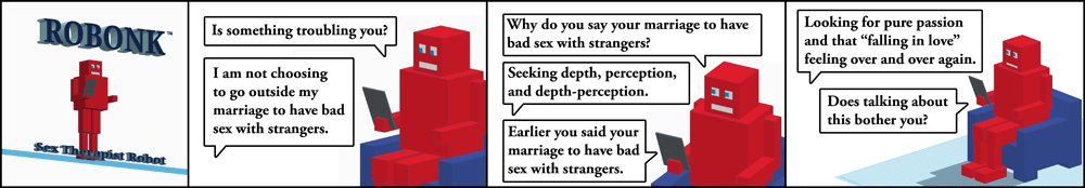
We’ll start with one of the initial five alpha-level strips.

One of the first five strips. That’s the font I went with for the human and Robonk.
I chose that size and that font and went at it. I received some feedback that a robot font and/or talk bubble might be fun for the robot. I like the cleaner bubble, so that stayed, but after playing with some computer theme fonts, I found a winner. The human’s text got lost a little though, so I bolded it up. Balance achieved.
Did I pick the best font size out of the gate? Probably not. So, time for some trials. This is strip #00000 with the original font size, everything at 90%, and everything at 80%. This is not a perfect trial because with the smaller type, I might have gone with a different line breaks, but it gets across the basic idea all the same.
100%
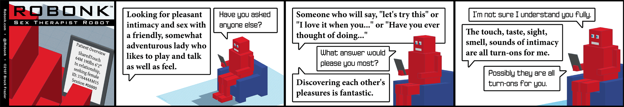
90%
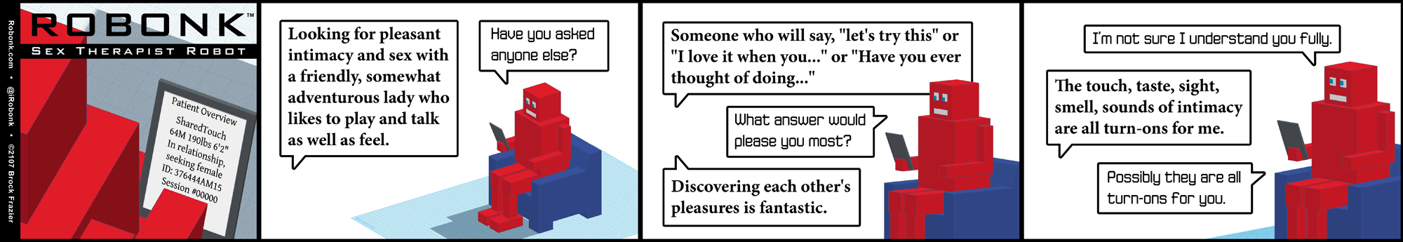
80%
I decided that 90% was the winner and am going with that. Time will tell whether that was a reasonable decision or not.